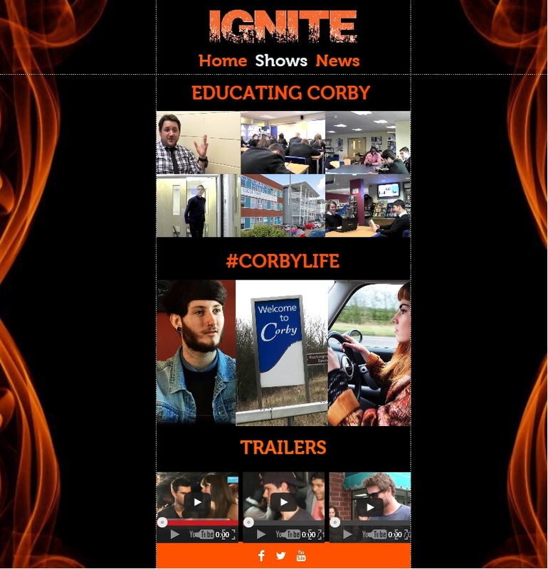
Strengths:
This page was shown to be effective, as a result of the fact that there are a plethora of images that relate to each show, and they are shown in many different ways. ‘the shows page has a unique design, with lots of images shown in different sizes.’ Therefore, the page is dynamic because of the fact that we represent the genres of our shows explicitly, with the use of varying images throughout the entire website. The images are extremely large and of a high quality, thus meaning that the depictions of our programming are entirely positive – with this in itself creating a sense of excitement about the Ignite brand, due to the way that the shows are highlighted in such a stand out manner.
Another strength that we received from audience feedback was the fact that we not only included large images on this page, but we also included the trailers for each show. ‘this page combines images of the shows with the trailers’. This was shown to be a positive of the page, though we also received feedback that this was a negative, due to the fact that there was seen to be too much content within one page of our website. It depended on the audience member, so although this particular member seen the amount of content at a positive, some were unable to have the same perspective. However, in terms of this being a positive, it was useful to gain feedback because we were able to interpret the fact that it was still beneficial to our overall website to use the trailers with the images, though ultimately we decided to show them on different pages.
One audience member stated ‘the page is exciting because it includes lots of images, these images show off all of the shows well.’ This was important feedback because, although we ended up changing the overall design and structure of this page, we were able to understand that the use of these images was extremely useful for our website. Therefore, we decided to include many images within our site, though just not in this kind of presentation – as we wished to adhere to the dynamic presentation of all of our information. We put most of the images on this page into a slideshow on the home page, meaning that the audience are able to see all of the content easily – though without having to navigate for a long period of time.
Weaknesses:
This page of the website was shown to have too many images, according to the feedback that we received. ‘There are too many images on this page and not enough information about them’. This was shown to be a weakness because of the fact that the audience were unable to become involved with the Ignite brand, because there was not enough relevant textual content to combine with the amount of images within the page. As a result of this, we had to alter the overall design of the page, in order to ensure that we could combine large images and relevant information about them and the shows. Moreover, we had to make sure that we did not include as many images because they became confusing for the audience, and thus we had to alter the way we conveyed the information about the shows within the website.
Another weakness of this page was the fact that the page was extremely linear and far too long, meaning that it required the audience to navigate down the page for too long – meaning that they could become disinterested with the information on the website about the Ignite brand. ‘This page is far too long and takes lots of time to navigate towards the bottom’. This feedback denotes the fact that the page had images that were too large, and this meant that it took far too long in order to get to the bottom, which is where the relevant information about web 2.0 and social networking links were placed. We had to alter the way that the images looked, and this involved an entire overhaul of the way that this page worked, because we received far too many weaknesses about the presentation of this page. Ultimately, we decided to alter our overall design by making this a News page, whilst the third page of the site, which was originally a News page, now became a trailers page.
The aforementioned overhaul of the website structure was also down to this next piece of feedback that we received, as this stated ‘the page has too many graphics, in terms of images and videos. They need to spread out across the entire website’. As a result of this feedback, we decided to make this page a ‘News’ page, and to change the entire design so that we could combine the text and smaller images well, whilst providing the relevant information about them. Also, the third page was now dedicated to the trailers, meaning that we had spread out all of the information about the flagship shows – with this being because of all of the feedback that we received from our audience.
The final weakness of this page was the fact that not all of the shows were depicted, despite this being the page dedicated to our flagship programming. This was because of the fact that we had not yet filmed the required footage from our soap opera ‘Oakley Vale’, meaning that we could not include images of the show because we had not filmed them. ‘There is no mention of the third show, even though it is mentioned in other products.’ We could not avoid this problem within our draft, and when he had all of the footage, we were able to include all of the images needed, though in a totally different design, in order to give the audience the opportunity to become enticed to the programming.
