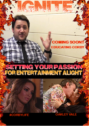
Strengths:
We received feedback that we used a good blend of images and text, and that they had been designed in a layout that appeared as interesting. From the audience, we received feedback of ‘there is a good use of text and images, and the design appeals to the audience.’ – with this being an evident strength of the media product because of the way that we have made our design dynamic in order to appeal to the younger psychographic audience. We have been conventional by combining the textual and graphic elements in this manner and it was shown to be effective within our draft, hence why we kept an almost identical layout for the final product.
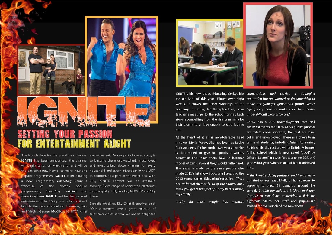
The use of the flame border was shown yet again to be a strength within this product, due to the fact that we had highlighted our brand identity concurrently across all of the products. ‘the flame border is consistent with all products and relates to the Ignite brand.’ This feedback was presented to us within all of our products and this is because it clearly conveys the importance of brand identity within a new channel, as we wanted to keep this semantic theme of fire going, in order to give the audience the opportunity to become engaged with our ‘hot’ programming, as it would make the brand appear as exciting and vibrant.
The logo and the slogan of the brand are entirely visible within the page and this was shown to be another strength of the double page spread, because we wanted this to be at the front of the audience’s minds – thus allowing the Ignite brand to become synonymous for them. ‘the positioning of the Ignite logo and the slogan is very clear.’
This feedback connoted that we wanted to depict these aspects as extremely large so that they stood out entirely on the page, thus meaning that the audience would be more likely to remember the entire brand identity that the company is offering. It is also consistent with other products because we have wanted to make the brand identity stand out in a consistent fashion, and we primarily achieved this within our draft products.
Weaknesses:
A weakness of the draft is the fact that the font used for the slogan did not appear as high quality. ‘the slogan is blurry, which makes it look unprofessional’. This was feedback that we received about the font within the slogan, and this is something that we learnt about within all of the products that we created, which is why we decided to alter the font across all of the products that we created for the Ignite brand. This font had issues in terms of pixels and it did not make the product visually pleasing for the audience, hence meaning that the audience could potentially not be attracted to the Ignite brand, as a result of unprofessional aspects within the marketing campaign.
The font was shown to be inconsistent across both pages of the double page spread, as the second page is highlighted all within a bold font, whereas this is not the case with the first page. ‘the text on both pages looks different and it is not consistent’. This is feedback that we received that related to this issue, and this meant that we had to fix the issues in order to ensure that the entire product was consistent, as this would increase the overall quality of the brand identity from ignite. We had to alter the way that the typeface looked, in order to make sure that the professionalism of the brand was highlighted, as this would ensure that the audience could become engaged with the product and our overall brand.
There was a page number for the second page but not the first page, and this was yet another inconsistency within this product. ‘the page number is only on one side of the page and it does not stand out’. We received this feedback because we did not include the number of the left hand side, along with the fact that the colour of the typography did not make it stand out enough, as we would have liked. This therefore was a weakness because it did not add to the visually pleasing aspects of the product and we needed to make subsequent alterations. In order to fix this issue, we added a page number on both pages of the double page spread, as this would make the product realistic and it would adhere to the conventional aspects of a magazine. Moreover, we decided that we would have to change the colour of the page number in order to make sure that it was entirely visible in contrast to the fire border that we used for the double page spread.
We received feedback that the draft copy only mentioned one of the shows that Ignite offers, rather than discussing elements about the three flagship shows of the brand, because this is what we have done with all of the other products within the cohesive marketing campaign. ‘the double page spread only talks about one show, but it includes images from a range of shows’. This feedback highlights a weakness within the product, because of the fact that it does not include the relevant information that relates to the images, meaning that the audience are only able to get information about the flagship shows from images – rather than the textual content of the magazine. In accordance to this feedback, we decided that we needed to alter the textual content, in order to include information that was relevant to all three flagship shows, because this would give the audience the opportunity to become engaged to the range of genres available.
We received feedback that we used a good blend of images and text, and that they had been designed in a layout that appeared as interesting. From the audience, we received feedback of ‘there is a good use of text and images, and the design appeals to the audience.’ – with this being an evident strength of the media product because of the way that we have made our design dynamic in order to appeal to the younger psychographic audience. We have been conventional by combining the textual and graphic elements in this manner and it was shown to be effective within our draft, hence why we kept an almost identical layout for the final product.
The use of the flame border was shown yet again to be a strength within this product, due to the fact that we had highlighted our brand identity concurrently across all of the products. ‘the flame border is consistent with all products and relates to the Ignite brand.’ This feedback was presented to us within all of our products and this is because it clearly conveys the importance of brand identity within a new channel, as we wanted to keep this semantic theme of fire going, in order to give the audience the opportunity to become engaged with our ‘hot’ programming, as it would make the brand appear as exciting and vibrant.
The logo and the slogan of the brand are entirely visible within the page and this was shown to be another strength of the double page spread, because we wanted this to be at the front of the audience’s minds – thus allowing the Ignite brand to become synonymous for them. ‘the positioning of the Ignite logo and the slogan is very clear.’
This feedback connoted that we wanted to depict these aspects as extremely large so that they stood out entirely on the page, thus meaning that the audience would be more likely to remember the entire brand identity that the company is offering. It is also consistent with other products because we have wanted to make the brand identity stand out in a consistent fashion, and we primarily achieved this within our draft products.
Weaknesses:
A weakness of the draft is the fact that the font used for the slogan did not appear as high quality. ‘the slogan is blurry, which makes it look unprofessional’. This was feedback that we received about the font within the slogan, and this is something that we learnt about within all of the products that we created, which is why we decided to alter the font across all of the products that we created for the Ignite brand. This font had issues in terms of pixels and it did not make the product visually pleasing for the audience, hence meaning that the audience could potentially not be attracted to the Ignite brand, as a result of unprofessional aspects within the marketing campaign.
The font was shown to be inconsistent across both pages of the double page spread, as the second page is highlighted all within a bold font, whereas this is not the case with the first page. ‘the text on both pages looks different and it is not consistent’. This is feedback that we received that related to this issue, and this meant that we had to fix the issues in order to ensure that the entire product was consistent, as this would increase the overall quality of the brand identity from ignite. We had to alter the way that the typeface looked, in order to make sure that the professionalism of the brand was highlighted, as this would ensure that the audience could become engaged with the product and our overall brand.
There was a page number for the second page but not the first page, and this was yet another inconsistency within this product. ‘the page number is only on one side of the page and it does not stand out’. We received this feedback because we did not include the number of the left hand side, along with the fact that the colour of the typography did not make it stand out enough, as we would have liked. This therefore was a weakness because it did not add to the visually pleasing aspects of the product and we needed to make subsequent alterations. In order to fix this issue, we added a page number on both pages of the double page spread, as this would make the product realistic and it would adhere to the conventional aspects of a magazine. Moreover, we decided that we would have to change the colour of the page number in order to make sure that it was entirely visible in contrast to the fire border that we used for the double page spread.
We received feedback that the draft copy only mentioned one of the shows that Ignite offers, rather than discussing elements about the three flagship shows of the brand, because this is what we have done with all of the other products within the cohesive marketing campaign. ‘the double page spread only talks about one show, but it includes images from a range of shows’. This feedback highlights a weakness within the product, because of the fact that it does not include the relevant information that relates to the images, meaning that the audience are only able to get information about the flagship shows from images – rather than the textual content of the magazine. In accordance to this feedback, we decided that we needed to alter the textual content, in order to include information that was relevant to all three flagship shows, because this would give the audience the opportunity to become engaged to the range of genres available.