This is the page that we have now changed to the trailers page, though we have used almost this exact design for the News page that has now replaced the Shows page.
Strengths:
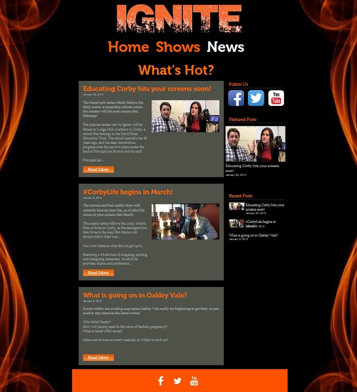
This was the page that received the most positive feedback, and this is the ultimate reasoning for keeping this page in essentially the exact same layout and design for the final website.
Firstly, we received positive feedback about the overall layout of the page, due to the fact that all of the news stories are available in a linear fashion. ‘this page makes all of the news stories extremely easy to see’. This was feedback that we received in accordance to the way that we presented our news stories in a linear manner, meaning that the audience would simply have to scroll down the page in order to gain information about each flagship show that Ignite offers. They are all lined in a consistent fashion and this means that the website appears as professional, because of the way that each box uses the same typography, they are aligned and they all give a variety of information about the shows.
Another strength that we received from feedback was the way that the social networking links were placed at the right of the page, as well as consistently at the bottom with the use of the social networking bar. ‘the audience are able to use social networking easily, as links are placed around the page well’. A strength of this feedback was the fact that it conveyed a clear intention on our target audience, due to the fact that we were aiming at a psychographic audience of people that seek expressionism through social media, meaning that the audience can become active with their own opinions on Twitter and Facebook.
The links to a separate post encourage the audience to navigate deeper into the website, with the purpose of this being to immerse the audience into the brand, hence drawing them towards the variety of shows that Ignite offers. ‘the links allow the audience to find out information about the shows.’ This feedback was extremely beneficial to our draft, because we wanted to keep this entire structure in place, meaning that we wanted to keep these links within the site in this manner. The audience is given the opportunity to click an icon that says ‘read more’, which yet again creates an active audience, which is entirely purposeful for the younger demographic – because this can generate a technological word-of-mouth, as the audience will seek pleasure from finding out all of the information about the programmes.
Weaknesses:
This page was shown to be the best page of the website, due to the fact that we did not receive much negative feedback about it, and we actually received many positives also. The first weakness was the fact that the news stories are covered by a grey background, and this is inconsistent with the rest of the website, as this colour is not shown to be anywhere else and it stands out far too much against the black, fiery background of the website. ‘the grey colour of the news stories does not match with the rest of the website’. This feedback conveys the fact that we had to alter this colour in order to present the brand identity of Ignite to be consistent, in order to subsequently draw the audience towards the brand. By changing the colour of these boxes to a darker colour, it would match the rest of the site and would make it appear as more visually pleasing.
The other weakness that we received is the fact that the text is quite hard to see, with this being because of the last aforementioned problem, but also because the text was too similar a colour. ‘the text of the articles is hard to see unless you navigate into the individual post itself’. This feedback highlighted that we needed to alter the choice of colour for text, in order to make it contrast against the dark background. We have done this within our other products, as we managed to use the orange colour to act as the antithesis of the black colour – hence meaning that everything is entirely visible. Moreover, by ensuring a sheer contrast, it creates a vibrant sense about the brand, with this being integral because we are aiming at a younger psychographic audience that focus upon image – meaning that we needed to ensure that the products were visually pleasing enough for the audience.
The news is inconsistent because of the fact that the third article, which relates to the Oakley Vale programme, has no image to support the article. ‘the news stories all use an image, except the third show’. This was due to the fact that we had not yet filmed the required footage for the show and this therefore became a weakness of this page, due to the fact that it was not fully consistent in terms of the textual content blending with the images. This was only a problem with the draft, as we were able to add in images from this show across all of the pages on our website after we had completed the filming for the show – meaning that we were able to highlight the consistency fully.
